
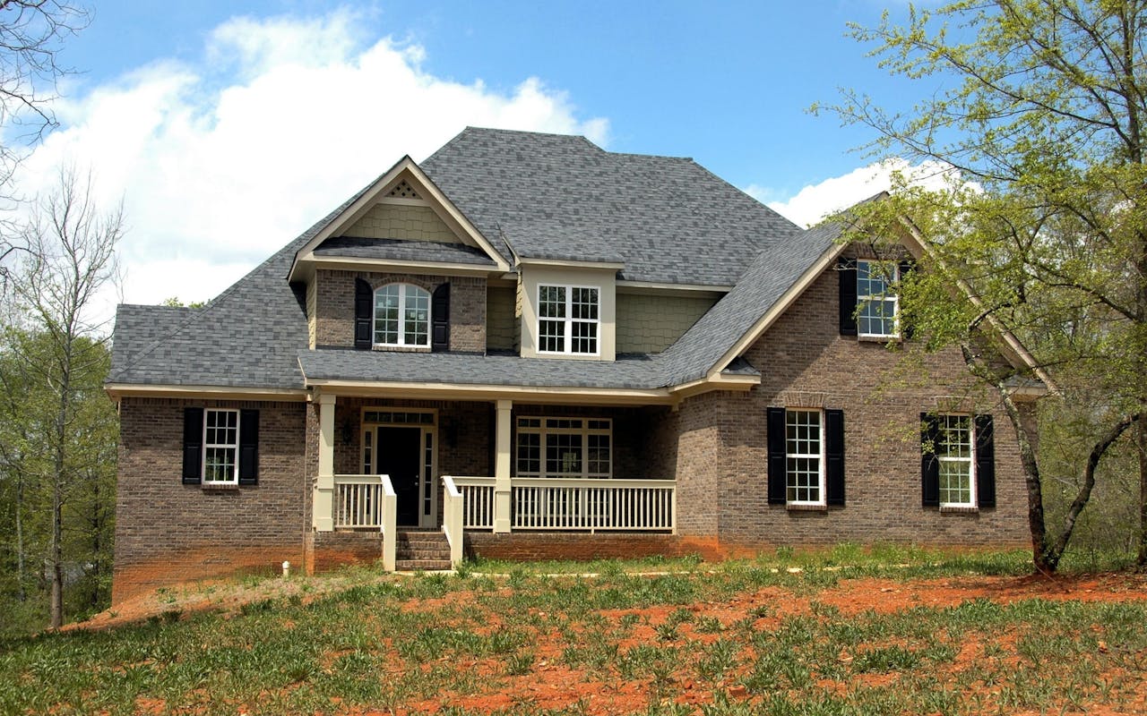

Home exteriors read like a quick story. From the street, your eye grabs the biggest shapes first, then it scans color, texture, and a few focal points like the front door. When those elements feel consistent, the whole home looks “put together” even if nothing is fancy. When they clash, even expensive upgrades can look off.
Table of Contents
Start With The Big Shapes
The overall silhouette sets expectations before anyone notices details. Roof pitch, gables, dormers, and porch massing create the “outline” your brain recognizes in a split second. If the outline is busy, simplifying colors and trim can calm it down.
Proportion matters, too. Tall homes often look best with vertical emphasis, while low ranches benefit from long, horizontal lines. When you choose exterior updates, think about whether they reinforce the home’s natural shape or fight it.
Siding And Material Texture
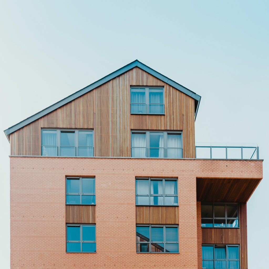
Siding is usually the largest visual surface, so it controls the home’s baseline vibe. Smooth materials feel modern and clean, while textured materials feel cozy and traditional. Mixing materials can look sharp, but only when it’s intentional and limited to 2-3 surfaces.
If the siding is damaged, outdated, or overly shiny, it can make the whole exterior feel tired. When you plan a refresh, you might decide to remove vinyl siding properly so the layers beneath can be repaired, insulated, or replaced with a finish that fits the home better. The key is choosing a material and profile that matches the scale of the house, not just the trend of the moment.
Color And Contrast
Color is the fastest way to change a home’s personality. A light body color can make a house look larger and brighter, while a darker color can make it feel grounded and dramatic. High contrast trim highlights edges and details, but too much contrast can turn every line into “visual noise.”
A simple approach is to pick 1 main body color, 1 trim color, and 1 accent color. The accent is where you can have fun, like a door color or a small detail. If the home already has strong texture (stone, brick, heavy shakes), a softer color contrast often looks more balanced.
Rooflines, Trim, And The “Crisp Edge” Effect
Trim works like the frame around a picture. Crisp trim lines can make a home look newer, straighter, and more finished. Wide trim can add presence, but it also makes every joint and corner more noticeable, so craftsmanship matters.
Roof color and shingle pattern also influence the look more than people expect. A roof that is too light can feel disconnected, and a roof that is too dark can overpower a small home. When in doubt, neutral roof tones usually play well with most palettes and materials.
Entry Features That Pull The Eye In
Most people look for a focal point, and the front entry is the natural target. Doors, porch columns, steps, railings, and house numbers all contribute to that “welcome” moment. If the entry is hard to spot, the home can feel flat from the street.
Make The Entry Easy To Read
A clear path, a visible door color, and lighting that frames the entry help visitors (and your own eyes) understand where to look. Even small updates like a new mailbox, modern numbers, or a cleaner railing style can sharpen the whole facade. Think “simple and readable,” not “more stuff.”
Garage Doors As A Visual Anchor
In many homes, the garage door is one of the biggest single surfaces facing the street. Real Simple points out that the garage door is a large, highly visible part of the exterior, which makes its color and finish a major lever for a quick visual upgrade. If the garage dominates the front elevation, this one choice can either blend smoothly or steal attention in the wrong way.
Here are a few reliable garage-door color moves that tend to look intentional:
- Match the garage door to the main body color to reduce visual bulk.
- Match the garage door to trim for a cleaner “outlined” look.
- Use a wood-tone or faux-wood finish to add warmth without repainting the whole exterior.
- Avoid ultra-bright whites unless the home’s trim is also bright and consistent.
Landscaping And Hardscape Shape The “Frame”
Landscaping is the soft frame, and hardscape is the structure that guides your eye. Healthy shrubs, a defined edge, and a clear walkway can make an older home feel cared for, even before you touch the siding or paint. Hardscape choices like paver patterns, steps, and retaining walls also create strong lines that either complement the house or compete with it.
If you want the biggest impact with the least risk, aim for clean geometry and consistent materials. Too many competing stones, colors, and border styles can make the front yard feel messy, which drags down the house with it.
Small Details That Quietly Change Everything
Lighting, gutters, downspouts, and vents are not exciting, but they are everywhere. When those pieces are mismatched or obviously aging, the home reads as “unfinished.” When they’re aligned in color and style, the exterior feels calmer and newer.
A Bob Vila roundup of curb-appeal trends for 2025 highlights moves like bold front-door moments, artistic hardscaping, and more natural landscaping, which all point to the same idea: the best exteriors feel edited, not over-decorated. If you want a trend-safe approach, choose a 1 “statement” element and keep the rest quiet and cohesive.
The best-looking exteriors usually follow one rule: fewer, stronger decisions. Pick materials that fit the home’s shape, keep the palette tight, and let one focal point do the talking. When the big surfaces, the entry, and the framing elements all agree, the whole house looks better from every angle.