
Combination charts are a great way to visualize data and can be used in many different situations. A combination chart can help you quickly and easily see how data changes over time or how different values are related. It can also help you identify trends and patterns in your data. Let’s take a closer look at combination charts and how to use them to analyze data sets.
Table of Contents
What are combination charts?
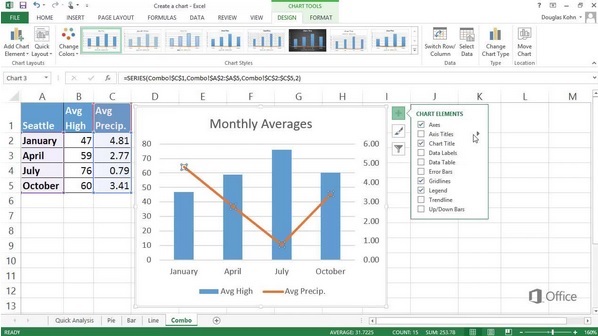
A combination chart is a graphical representation that combines two or more chart types into a single chart. Each data series is displayed in a different chart type, and the data is plotted according to the scale of the respective chart. Area, column and line combination charts are used to display data that changes over time.
Each of these types of charts will allow you to compare different data series in different ways. For example, you can compare the total amount of sales in each region against the total population in each region, or you can compare the number of sales in each region against the percentage of the population that lives in that region.
Why use a combination chart?
There are many reasons to use a combination chart for your data analysis. One of the most common is when you want to compare two different types of data. For example, you might want to see how your company’s sales have changed over time compared with the overall market trend. In this case, you would create a column chart that shows the sales data and then overlay a line chart that shows the market trend.
Another reason to use a combination chart is when you want to compare two or more sets of data that are measured on different scales. For example, you might want to see how your company’s sales have changed over time compared with your competitors’ sales. In this case, you would create a column chart that shows each company’s sales data and then overlay a line chart that compares them all.
A third reason to use a combination chart is when you want to show changes in data over time. For example, you might want to see how your website’s traffic has changed over time. In this case, you would create a line chart that shows the web site’s traffic data and then overlay it with another line chart that shows the trend for overall internet traffic.
What are some uses for combination charts?

A combination chart is a powerful tool that businesses can use to track their progress over time. This type of chart allows you to plot two or more types of data on the same graph, making it easy to see how they are related. There are many different ways to use combination charts, and the possibilities are limitless.
One way to use a combination chart is to track sales data and inventory levels. This can help you to see how your sales are changing over time and whether you need to order more inventory to meet demand. You can also use a combination chart to track website traffic and conversions. This can help you to see which pages are driving the most traffic and which pages are converting the most visitors into customers.
Another common use for combination charts is to track budget data and actual spending. This can help you to see where you are over budget and identify areas where you can cut back. You can also use a combination chart to track customer satisfaction and complaints. This can help you to see which areas of your business need improvement and identify potential problems before they become too serious.
The possibilities are endless when it comes to using combination charts. By tracking different types of data simultaneously, you can gain a better understanding of how your business is performing. This can help you to make more informed decisions and improve your bottom line.
Combination charts are a versatile data visualization tool and can prove to be a great way to track multiple data sets simultaneously. They can also help you to get a more holistic view of your data. Additionally, combo charts can be used to identify relationships between different data sets.